Oct 29, 2009
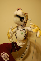
Meet Virgil!
I'd like to introduce you to Virgil, the newest member of my puppet entourage. He is a jaguar. More importantly (for him), he is a vegetarian jaguar. He would have been awfully disappointed in me for having eaten a ham-topped-cheeseburger this evening.
I built him originally for Project Puppet's 'Jungle' contest, but I wasn't able to finish him in time for various reasons. Some facts about him: his eyes are 28mm glass lion eyes from a taxidermy shop, his fur is made from a soft towel fabric I found at JoAnn's (painted yellow with acrylics and covered in spots with black Sharpies and brown/red Prismacolor markers), within his arms and hands are wires to give him a stiff elbow or finger configuration, hidden at the base of his wrists are two metal threads to screw in the arm rods that I made for him, his nose and tongue were made from painted Sculpey molds (I need to go over his nose again, since it's chipping, and then cover it with a clear acrylic protectant). That's about it...if you have any questions, feel free to ask!
Anyway, please enjoy the photos. He took a lot of work, and I'm pretty happy with the results.
Oct 28, 2009
The Fantastic Mr. Fox
In a few weeks, the Roald Dahl classic, Fantastic Mr Fox comes to the big screen as a stop-motion feature directed by Wes Anderson. I've never actually read the book (shhhh...), but I would kind of like to before seeing the movie. Maybe I won't. I'll probably just go watch it...
Running Platypus
So, I've got this whole platypus thing going on. I did an animation of him running, so here it is. It of course will require a bit of tweaking, but for a first running test, not too bad.
Oct 17, 2009
Pixar Concept Art!
Sadly to say, I've only recently come to appreciate concept art as its own form. It tends to be beautiful in its own way--especially color and light studies. Concept art evokes feeling in a way that the final product never does. I wonder why more films aren't made with a heavier emphasis on the dramatic looks of concept art.
One of my favorite films from the past few years is Finding Nemo. I remember when I first saw a teaser for it from the Monsters, Inc. DVD--I was sold on the idea from the beginning. The movie has such a strong quality to it: a father learning to deal with his fear of loss, a son realizing the value of his dad, an unexpected journey. What I never realized was how intentional the different moods of the film were. Thinking about it, it is now very obvious, but at the time, it accomplished exactly what it should have: people had the feelings evoked without really knowing it. The beginning of the film is set in warm, light blues for a feeling of safety and security in the reef. As the journey begins, deeper blues set in--symbolizing both distance from home and greater danger. The dark blues of the shark's hideaway and the deep-sea moment are frightening. Then, suddenly, the medium blues of the open ocean don't seem quite as bad anymore. The jellyfish are an inviting--almost dreamy--pink and purple, though the bright red of Dory's wound from them serves as a stark contrast to their seeming safety. Finally, in Sydney Harbor, the dull greens and muckier water show despair: Marlin thinking Nemo is dead and Dory not knowing where she is or what she's doing. Below is an image from Greg Hull, one of the concept artists for the film.
Other films in general (and Pixar films in particular) spend a lot of time getting colors and moods right. A character's environment plays a huge role in an audience interpretation of a scene. A laugh on a sunny day in a park seems light and innocent. Move that laugh to a dark, dank room, and it's either evil or nervousness.
I found a website today which has an OK collection of Pixar concept art. I would recommend the various "Art of" books, particularly from Finding Nemo, Cars, and Ratatouille. I would say Monsters, Inc., but I don't have that book, and it costs around $150, since it's now out of print.
Additionally, for Disney concepts, their "Art of" books (I remember "Art of the Lion King" being really good; also, "The Tarzan Chronicles") and "Before the Animation Begins."
Here are some great examples of the different styles of concept art:
Aladdin (Aladdin's hideaway)
Oct 15, 2009
Oct 3, 2009
The Return of Cider
Slate has a cool article about the history of (alcoholic) cider in America. It was hugely popular in our early days, waned in the middle of our existence, and has begun a comeback. I'd love it if the phrase could be "as American as apple pie and cider". When I visited London in 2005, I enjoyed their cider a bit more than most of their ale (though both were delicious). It's nice to know that cider is becoming more respected, as it should be, since it is great, and that new cideries are appearing throughout the U.S., aiming to better the craft.
Makes me think about Johnny Appleseed. Do kids even learn about him anymore?
Subscribe to:
Posts (Atom)